The bland identity: trends in corporate logo design
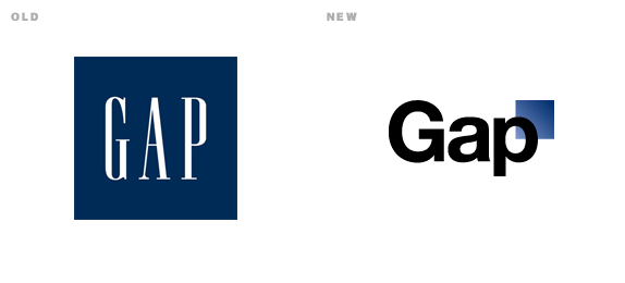
Gap’s recent faux pas is only the most recent in a slew of strong brands being genericized which has left me scratching my head. Why? Why take strong brands with strong identities and rework them to look like bad Chinese knock-offs? Or worse, give them looks that are completely inappropriate for the product. Corporate identity design 101 boys!
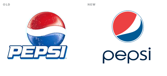
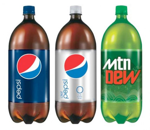
I’m all for contemporary looks, but there’s a line. Take Pepsi for instance. The new logo, paired with a pastel-colored ad campaign looks more like a yoga studio than a soft drink. The icon looks like a political campaign logo and the typeface is weak. It’s minimalism better suited for water than soda, and even that’s a stretch. And those billboards… ICK! Dandelion yellow doesn’t exactly say “thirst quenching.” How did that campaign ever make it past internal review?
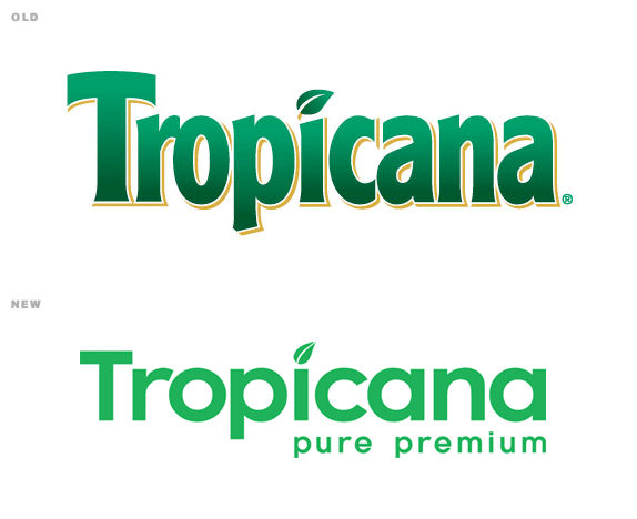
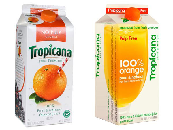
Next up in the Pepsi-cola debacle was Tropciana, who actually CTRL+Z’d the whole shebang after relentless ridicule from the design community. The logo was weaker, sure, but what’s even worse is the packaging design. The Arnell Group’s aim was to highlight the “purity” of the juice with a pure-looking package, but all they did was make it look underdeveloped and generic. Put it on a shelf next to the rest of the orange juice containers and it disappears from your eyes altogether.
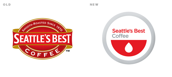
Now we move to good ‘ol Seattle’s Best Coffee. What comes to mind when you think of coffee? Comfort? Richness? Tradition? Relaxing? Or maybe a bleeding watermelon? Not only is the new identity much, much weaker, it’s not at all applicable to the type of product it’s supposed to represent.
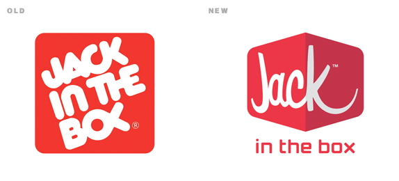
Jack in the Box certainly isn’t the prime offender in the latest round of logo fails, but it still made the list. It almost seems like they were trying to hint at old school diner astetic, but the message isn’t really clear. And as they say, if you have to explain your message, your message isn’t clear enough. It looks feminine – too feminine to be representing a burger joint, and no, it doesn’t scream pita, teriyaki or bacon chedder potato wedges either.
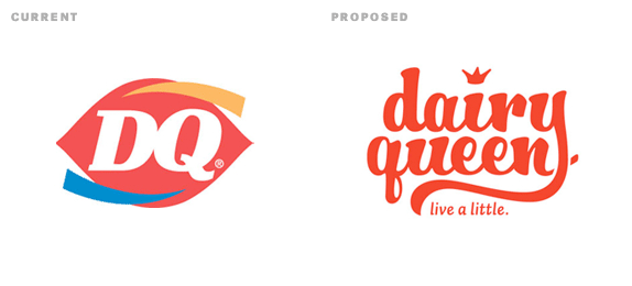
It seems the suites are hiring the wrong people for the job. While pros are getting psudo-intellectual and over-analytical about the modernization of brand identities, student work like this is hitting the nail on the head. Designed by Edrea Lita, it’s a clear improvement over Dairy Queen’s current strategy. Hire this woman immediately!


LEAVE-A-COMMENT
Use this handy device to make comments of your very own! As seen on TV! Only 3 easy payments of $19.95!
(your photo will post if you've made a gravatar)